The main visualisation of the frequency bands from the FFT values is a circular ring in the middle of the screen where each line represents a frequency band.
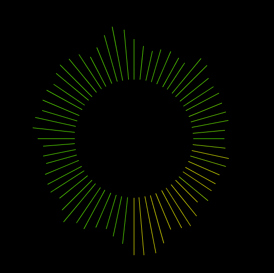
I have added a change to how this is visualised. Instead of it being just a normal circular shape, I have added some effects so the shape looks like it is in 3D. To do this, I have just added some value to the x2, y2, points in the line() function.
The shape moves throughout in a circular fashion:

This shows how it is going towards the top right. The planned effect is that it is reaching out of the screen.
Here it is in the bottom left: