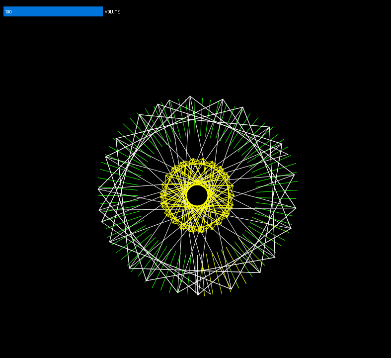
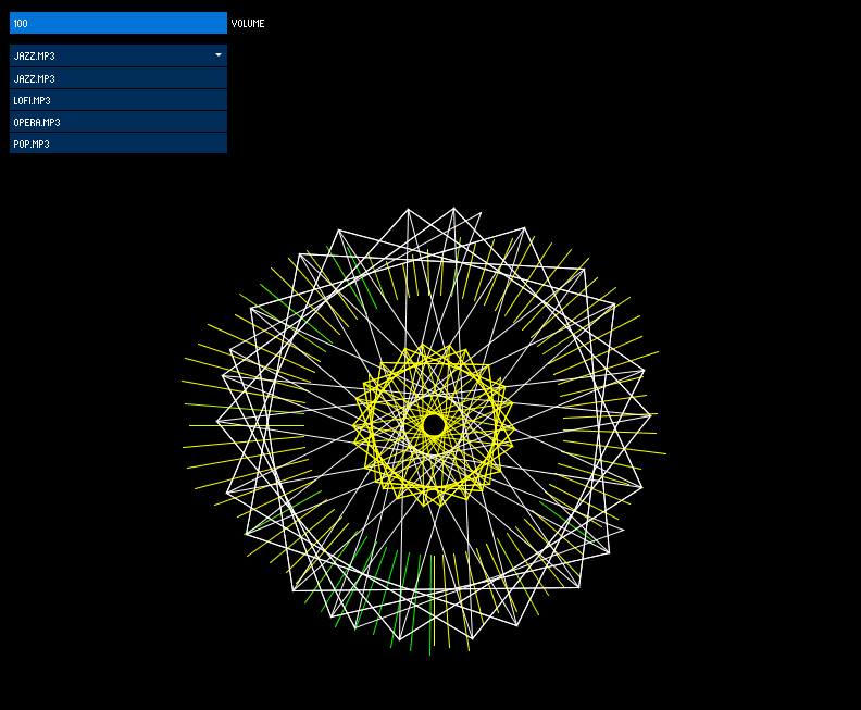
Using controlP5 I have added a slider to control the volume of the program.
To make sure it controlled the volume properly I used the map() function to ensure it mapped to the setGain() function properly, since a value of 0.0 is 100% volume.
After adding something to control the volume, I then used a scrollable list and populated it with all of the files within the data directory which is within the sketch’s directory. I also moved some of the sketch’s functionality to start working when a user has chosen a song to visualise.
After my initial attempt at visualising music, I had only used FFT and the audio waveform. I still hadn’t incorporated any beat detection and the visuals looked quite flat and the movement was not smooth enough to really see what was happening.
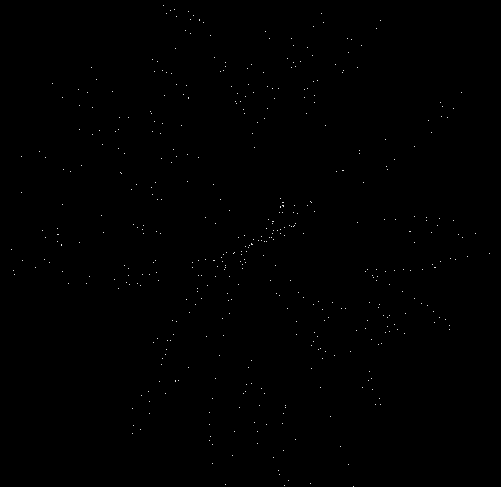
I knew that I didn’t want to move away from FFT since that analysis is going to be important to the project. I also knew I needed something that looked more visually appealing, and so I went about researching how to draw the FFT spectrum in a circle. This led me to https://forum.processing.org/two/discussion/823/issue-displaying-fft-in-a-circle-minim. This code gave this:
It was quite clear I didn’t want it in this form so I modified it to give this output:
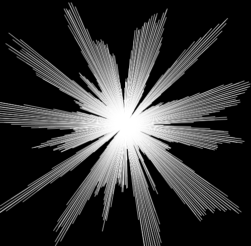
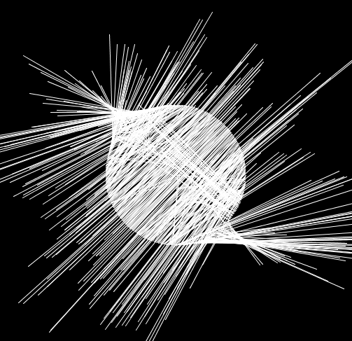
Instead of drawing points like the previous version I drew lines. To have it forming from a circle rather than the origin I changed the starting position of the origin for each line using sin and cos. This gave me:
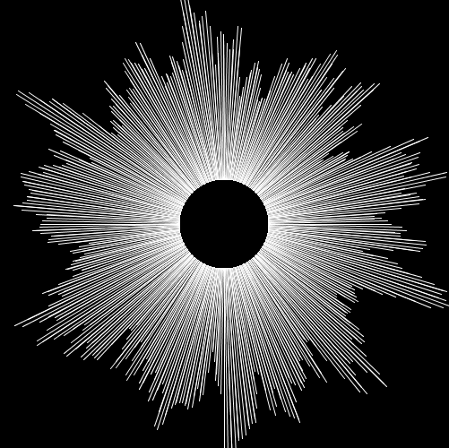
I wanted the spectrum to move outwards so I knew I had done something wrong but this was a cool effect nonetheless. I eventually got to what I wanted which was:
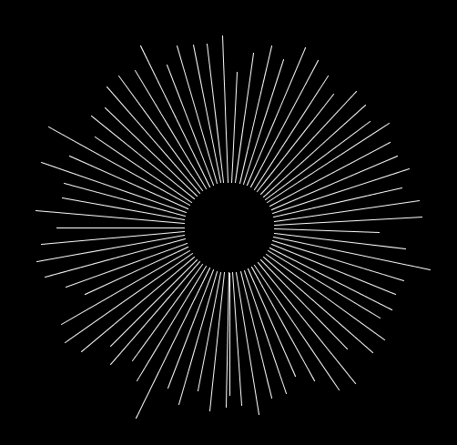
This isn’t enough to look interesting and it is still quite hard to see whats happening so I reduced the number of visible bands to make it feel smoother:
With this as the starting point I started watching videos about different music visualisations and one my friends even sent me this video:
I thought the visuals here were interesting and could be the basis of something in the future.
This then lead me to looking in to this video as I researched how to do custom shapes in Processing:
At around 8.40 mark he does something very interesting where the mouse position changes the shape in the sketch and this lay a basis for something in which I can add to my circular FFT sketch.
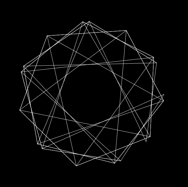
My initial sketch looking at this custom shape was this:
At this point I also thought having it rotate slowly could add something so I implemented that as well. The idea behind this was by watching some more of The Code Train videos, inparticular:
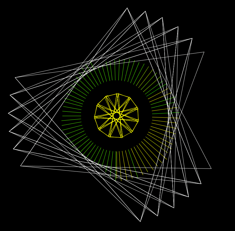
From here I started to implement beat detection for this shape. I know how to change the structure of the shape and how to change the radius of the shape. I looked at the sound energy analysis example included with the Minim package and changed my own code to change the shape and radius when a beat was detected. I also changed the stroke weight of the shape when a beat was detected.
As an afterthought, I decided to add another smaller shape in the middle of the larger shape and have it rotate in the other direction at a faster speed to add something a bit dynamic to the sketch.
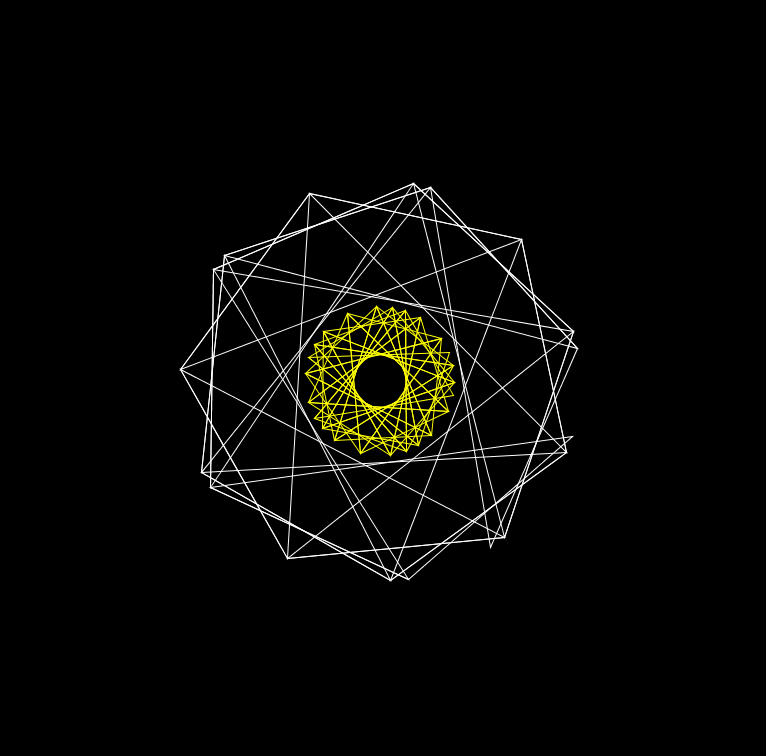
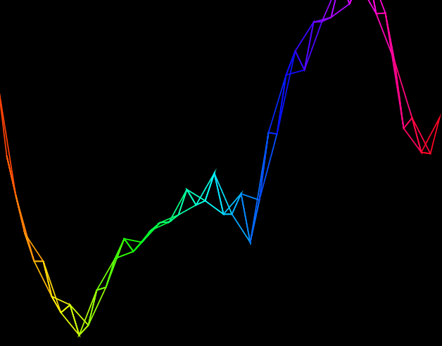
From here, I then decided to combine the circular FFT sketch and this sketch and added some colour to the circular FFT sketch. This resulted in:
I think this is an interesting visual and a good starting point to explore other ideas and techniques.
The main use cases for this tool I can think of can be broken in to three categories:
Education
Commercial
Healthcare
Education My initial thoughts for this project were that it could be used in an educational setting. I think if the visuals from the music are clear and the correlation is obvious it could be used across a range of studies spanning all ages to have something that could be hands-on and engaging, and (I don’t know for sure because I haven’t studied film or music) different.
A simple example could be that sad music is visualised using darker colours and tones and happier music is visualised using brighter colours. If you are studying film this tool could be used to gauge the emotions throughout a scene from the music that’s being played. In another example, it could be used to help music students have an idea as to how their music will be construed based on the visualisation. On top of this, it could help show how different aspects of music yield different visuals, and by extension evoke different emotions.
I think it could also be a really engaging tool for primary school children since the number of senses being triggered when exploring music has increased.
Commercial In a commercial sense it could be used by musicians to help build a visual backdrop which has been at most of the gigs I have been to. I think this has a similar train of thought to the primary school idea earlier, in the sense that now an artist’s music can be extended past its initial limitation of being sound and into a visual medium too.
I also thought about how people who are hard of hearing could benefit from a tool like this, especially at live events; it could potentially enhance the enjoyment of live music events for these people.
Healthcare Part of my initial research was into synaesthesia, and I came across a really interesting TedTalk from Jamie Ward (https://www.youtube.com/watch?v=taKx_stlUOQ). He was talking about how our knowledge of synaesthesia means that we might one day be able to create a visual dictionary of sorts. This tool could help increase our understanding of synaesthesia. An extension to this project could incorporate some kind of customisation for users to change the visuals according to what they would like. This could be interesting if given to someone who has synaesthesia, if they are able to map what they can see to the program, and then to see if this is a general visual for people with synaesthesia, or if that condition is unique to each individual.
Another idea I had was for it to be incorporated in to therapy and psychology in some kind of way, but I don’t have any research as of yet to corroborate this idea that it could be used here.
Tempo is defined by Cambridge Dictionary as “the speed at which a piece of music is played” and is measured in beats per minute. Tempo is usually what is trying to be followed when detecting a beat; this is relatively easy for humans to do by ear but seemingly challenging to be performed by a computer.
The first group of techniques revolves around “statistical streaming beat detection” with the first example of this being the analysis of sound energy. A sound will be heard as a beat when the energy of that sound is “largely superior” to the energies that have come before it. This distinct variation in the energy is a beat. To detect beats, an approach is to look at sound energy peaks.
To do this, compute the average sound energy of a signal and compare it to the “instant sound energy” at any given moment. The average energy here is not of the entire song as the beat of a song can change throughout, but rather the average sound energy of nearby samples. The article goes on to say:
an, bn = list of sound amplitude values captured every Te seconds for the left and right channels. “instant sound energy” will be represented by 1024 samples from both an and bn. 1024 samples is approximately 5×10^-2 seconds.
To detect a beat, the energy of the sound has to be greater than the local average energy. The “local average” will be represented by 44032 (closest number to 44100 divisible by 1024) samples, from an and bn, which is approximately one second.
Equation for finding the “instant energy”Equation for finding “local average energy”
B[0] and B[1] is just an and bn.
By comparing e to <E>*C, where C is a constant which adjusts the sensitivity of the algorithm, if e is greater than <E>*C then it is a beat.
A way of improving this algorithm is by keeping a list of the history of instant energies (E). E has to be approximately 1 second (which is 44032 samples). Since 44032/1024 is 43, E[0] will contain the newest energy and E[42] will contain the oldest energy. All values for E are calculated on groups of 1024 samples.
The obvious drawback to this is how to choose the constant C. This value can be calculated using another algorithm.
This finds the variance of the energies of the energy value and the average energy value. V is then used in this algorithm:
Again, if e > (<E> * C) then there is a beat.
Another method of beat detection is Frequency analysis using the Fast Fourier Transform. This is done by looking at the frequency spectrum that is produced by using FFT. The frequency energy from each sub-band can then be calculated and compared, much like the sound energy method.
If the number of sub-bands was set to 32 then we could compute the “instant energy” here using:
Es[i] is the energy of the sub-band i which runs from 0-31. B contains the 1024 frequency amplitudes of the signal. The average energy is therefore computed using:
<Ei> contains the average of the last second of the signal. Now to see if there is a beat, the energy at a given sub-band has to be greater than the value of that sub-band’s average * C i.e. Es[i] > (<Ei> * C).
These are then implemented in Processing in the “Minim” library that can be found here: http://code.compartmental.net/tools/minim/. In the examples they show both sound energy and frequency energy analysis. Although the audio they provide has a clear beat, it is not as good at finding the beat of other audio I have fed in to it.
I know that beat detection will play a role in my visualisation, I am just unsure to implement it properly and in an effective way.
Something else I found that could be useful, although this might in too much detail.
Not sure whether some of the processes done here could help
Having played with some of the examples from Processing, my first attempt started with me revisiting the examples. Namely “FFTSpectrum” and “AudioWaveform” (Examples > Libraries > Sound > Analysis).
“FFTSpectrum” Processing example
I then began to change some of the features of the example, changing the colours of the blocks depending on their reading from the .analyze() method.
I had already looked at “Audio Waveform” in a bit more detail. I knew that I wanted to try and incorporate both so the first thing I did was add them both to a Processing sketch. I also changed the colour of the FFTSpectrum and played a different audio file that has a greater range of frequencies.
“FFTSpectrum” and “Audio Waveform” programs in a single Processing sketch
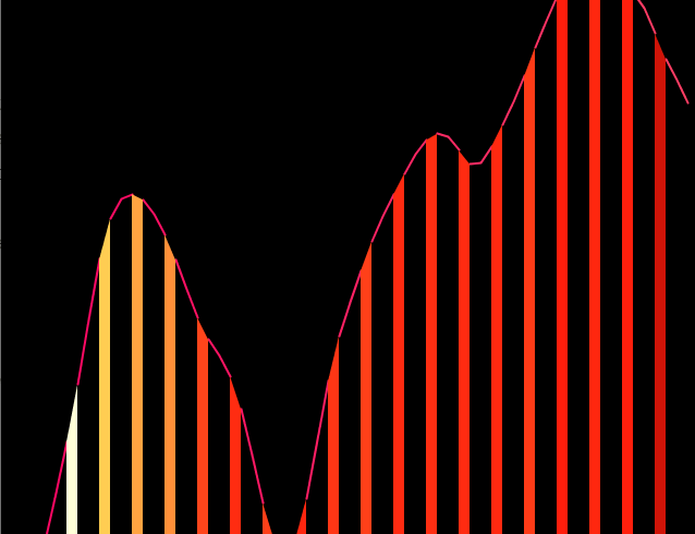
From here, I thought about moving the bands so they looked like they were related to the waveform rather than both being separate. To do this, I changed the y coordinate of the bands so that it was equal to the vertex from the waveform.
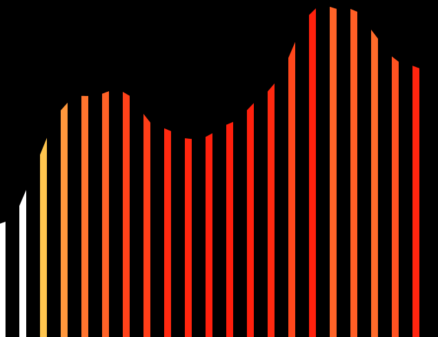
I changed the number of bands to 16, as well as the sample size for the wave so it looked a bit clearer. The relationship here is clear although it is now hard to see the importance of the bands. I also felt that the bands should have some space between them. To do this, I incremented the for loop by two rather than one so it would skip a band out.
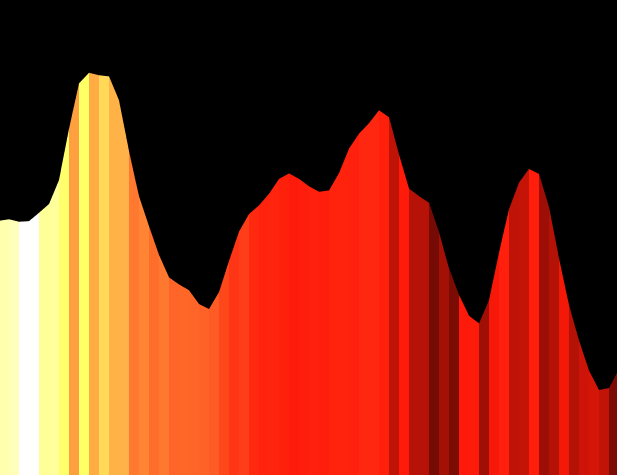
I think this looks a lot cleaner, especially on a black background. From here I then thought about doing the same for the wave, i.e. splitting the wave up and have it occupy the spaces between the bands. I also looked at taking the wave out completely and having an implicit wave represented by the bands.
I think not having the wave there looks a lot cleaner, but this version lacks the clarity that the wave offers. I also felt that the waves movements were too erratic to follow what was going on so I added a delay of 60 milliseconds at the end of the draw method.
Another way of having that implicit wave there but without the lines moving on the wave would be to use the quad() method rather than the rect() method to then set each vertex of the shape. A look in to how this looks is below.
With the waveWithout the wave
Another visual that I thought looked good was this without the gaps between the bands.
I am still working to try and figure out how to have the bands come from the wave still.
Sean Smith and Glen Williams, both from Texas A&M University wrote about visualising music in “A Visualization of Music”.
Published in 1997, they introduce the subject by stating that music notation is the most popular form of visualising method at the time. They then go on to propose their own method of visualising music that “makes use of color and three-dimensional space”.
They are able to map music data in to three-dimensional space by looking at individual tones, and then looking for instruments within a particular orchestration. Touching on the use of pitches and the range of pitches, it might be beneficial to look at minimum and maximum pitch values and then scale appropriately for that, rather than just have the entire range.
Smith and Williams then have individual instruments “mapped” to particular values. They also take rhythm in to account by mapping instruments playing at certain time periods, although I’m not sure how this would be helpful here as the audio is dynamic and doesn’t have to have a fixed rhythm.
References
Smith, S.M., and G.N. Williams. ‘A Visualization of Music’. In Proceedings. Visualization ’97 (Cat. No. 97CB36155), 499–503, 1997. https://doi.org/10.1109/VISUAL.1997.663931.
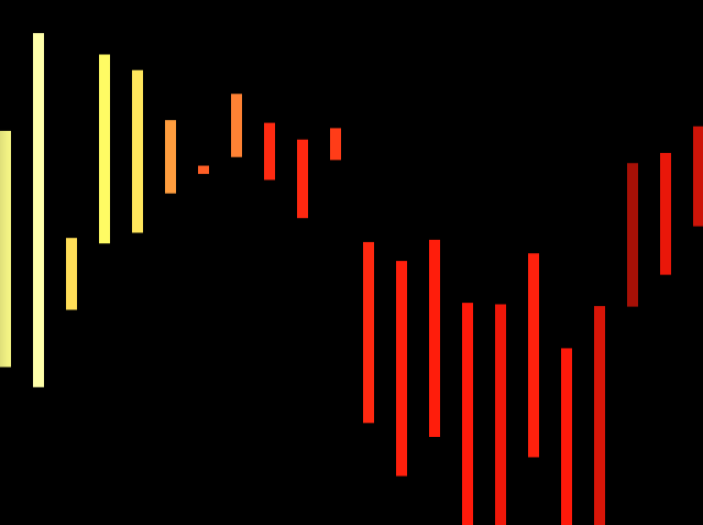
One of the examples included with Processing is the “AudioWaveform” program. In this program, it plays a sound and maps the waveform of the audio file. I loaded my own song in to the program.
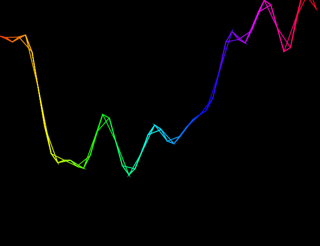
Firstly, I changed the colour of the wave to fit the HSB colour mode. This was done using the colorMode() method, setting the mode to HSB and the maximum range for all colour elements to be however many samples the program is taking per second. This achieves an effect like:
This effect is also showing the “TRIANGLE_STRIP” beginShape() mode. Since the wave is constructed with connected vertexes, this turns the vertexes into connected triangles. Experimenting with other beginShape() modes gives interesting effects too, such as “TRIANGLE”:
As the waves move up and down the triangles become more apparent. It also allows for the triangles to have some space between them. Similar effects can be obtained using “QUADS” and “QUAD_STRIP”. Another interesting effect is the “TRIANGLE_FAN”:
This connects each vertex with a single point. With more playing I think this could be an interesting visual.
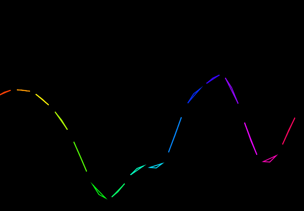
A sample setting in the high hundreds and beyond is probably too much as it shows more or less the wave and runs slow on my computer. I think a sample setting of around 30-60 gives the best results.
This is when the sample rate is at 500.
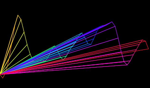
Since there is a higher range for the colours at a higher sample rate, the colours appear to be more dull. Reducing this maximum range in the colourMode method means that only a portion of the wave is coloured, with the rest being in red.
This is the sample rate again at 5000, but the maximum range in colorMode() at 100.
For the first part I took a twelve step color wheel and superimposed it over a circle of fifths…
Jack Ox
Jack Ox writes on the analysis of music, in “A Complex System for the Visualization of Music”, that the approach when analysing music can also comedown to whether a piece of music can be “reduced” to a single instrument and if it “is not dependent upon the timbre of different instruments“. This means that music can be analysed phonetically and harmonically. Ox expands on this: a harmonic analysis “would not” yield “meaningful information” for music which depends upon “carefully constructed timbre as its structure“. In addition, for “harmonically based music” Ox developed a system.
“For the first part I took a twelve step color wheel and superimposed it over a circle of fifths, which is the circular ordering of keys with closely related keys being next to each other and those not related directly across from each other. This ordering is the same as the color wheel. I made the minor keys 3 steps behind in an inner wheel, also in emulation of the circle of fifths. As the music modulates through keys, the same pattern occurs with the movement through the colors.“
Harmonic quality is the relative “dissonance or consonance of two or more notes playing at the same moment.” When it comes to silences, Ox questions how this should be appropriately visualised. “Should the silence be read as an empty instant of time, or is it in an equal balance of power with the ’on’ notes?” I think that silence within music has to be treated as any other part. A piece of music should be analysed in its entirety since that is what the creator has presented. For Ursonate, a 41 minute sound poem by Kurt Schwitters, Ox made “very bright, solid” colour using deep reds for longer prolonged parts an greenish yellow for short breaths. The phonetic analysis of Ursonate was done by mapping “how and where” vowels are made in the mouth.
“The list of colors for unrounded vowels comes from the warm side of the color wheel and rounded vowels are from the cool side. As the tongues moves down in the mouth to form different vowels, the color choice moves down the appropriate color list. Vowels formed in the front of the mouth, like ”i” and”e”, are a pure color. Vowels directly behind the teeth, like ”I”, have a 10% complimentary color component, the next step back in the mouth is 20%. complimentary, and so on until the back of the mouth, as in ”o” or ”u”, which has 50% complimentary color in the mixture.”
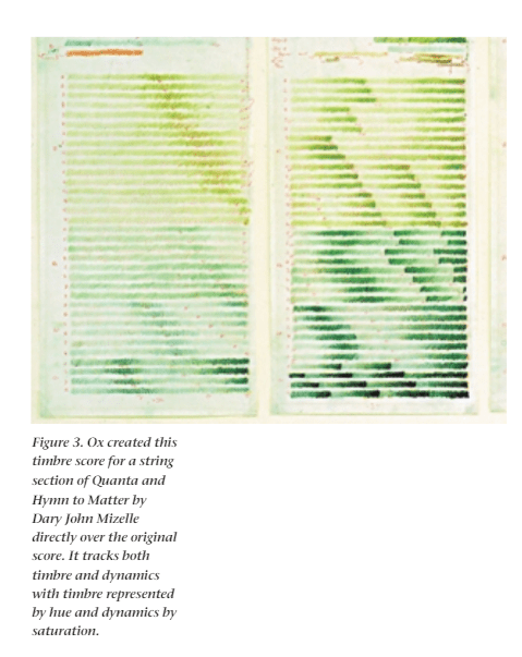
This is an image from “The 21st Century Virtual Reality Color Organ” Ox, Jack, and David Britton. ‘The 21st Century Virtual Reality Color Organ’. IEEE MultiMedia 7 (1 July 2000): 6–9.
On the “21st Century Virtual Reality Color Organ”, as music starts to play, a 3D image in black an white takes shape over a landscape. As music plays this is then populated with colour and shape as per the instrument’s family. I.e. depending on what instrument is playing, the associated instrument’s shapes and colours that have been predetermined are displayed. The hue of the colour is “based on a timbre analysis of which instrument is being played”. The saturation of the colour “reflects changing dynamics (loud and soft)“. Within the landscape, a high pitch will be higher in space.
For my project, I hadn’t properly considered changing the hue of the colours based on the instruments being played, nor had I thought about approaching the visualisation as a landscape to be populated (I have consistently been thinking about the WinAmp and Windows Movie Maker approach, and even though I might still go for something like this, it is always good to have a different viewpoint).
Looking at phonetic analysis was also an interesting approach for sound files which might just be the human voice. Ox’s use of deep block colours when using this phonetic approach was also interesting, as there still had to be a level of distinction between the sounds even though there were no musical instruments.
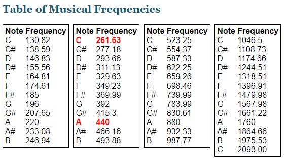
The almost scientific approach with the twelve step colour wheel and the circle of fifths was interesting too, and might be a good basis in which to colour this project. With knowledge of the colour wheel and the circle of fifths, different keys at any one time could be portrayed. I still don’t know how I would do this yet, as without pre-processing it might be hard to determine chord progression without knowing beforehand what frequencies are within the sound file. An idea would be to have all frequencies for all the musical notes (with different pitches) stored within the program beforehand, and then in real-time match the frequency to the note using frequency bands that I have set according to something like…
Ox, Jack. ‘A Complex System for the Visualization of Music’. In Unifying Themes in Complex Systems, edited by Ali A. Minai and Yaneer Bar-Yam, 111–17. Berlin, Heidelberg: Springer, 2006. https://doi.org/10.1007/978-3-540-35866-4_11.
Ox, Jack, and David Britton. ‘The 21st Century Virtual Reality Color Organ’. IEEE MultiMedia 7 (1 July 2000): 6–9.
This is the simplest method I have found to load an .mp3 file which is located in a directory called “data” which can be found in the same directory as the Processing sketch.
The examples included with Processing show how these audio files can be manipulated.
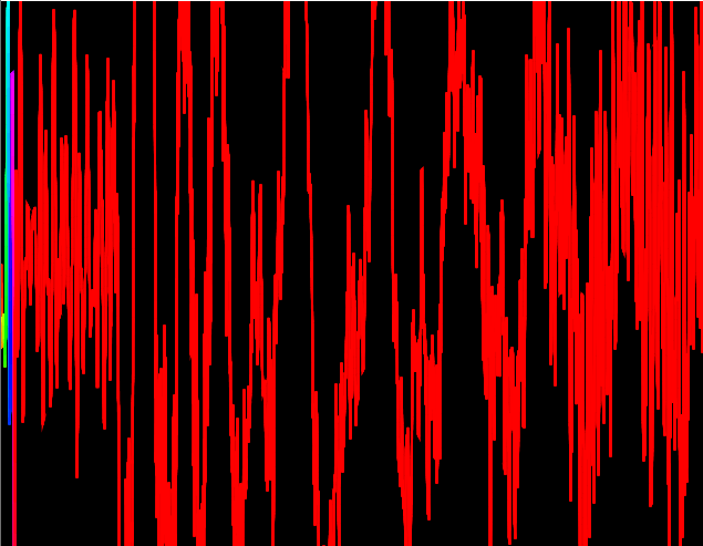
This was done using VSDC which was some freeware I found for video editing. It has an “audio abstraction” tool but I don’t think that has any correlation to the actual music. The “spectrum” tool gives the bar effects that you can see and that is clearly correlated to the music. This reminds me of the Windows Media Player visualiser
I found this on Reddit. The website is https://soundscape.world/. As you can see from the left hand side, you can customise what the music is and the environment should be a reflection of the music. I think it’s easier to see from the night time version. There are only two environments to choose from for the time being.
This is from Winamp which is a popular media player program that also supports music visualisation. I think the link between the music and the visualisation here is much clearer than the previous two tools showed above. This is because the links here are not subtle like the second tool and have more obvious links than the first tool.